In class we've been looking at PSA's and what makes them effective. One PSA I found effective was the one embedded bellow. The reason I think it's so effective is that they try to make it as relatable as possible. They use actors that are at the usual age that cyber bullying occurs. They also show how devastating cyber bulling can be, and what kind of effect it can have. I think the main thing that makes a PSA stand out is how relatable it is to the audience they are targeting, and I think the makers of this PSA pulled it off.
Wednesday 12 December 2012
Monday 10 December 2012
Video Production Assignment: 3:6:9 Exercise - Shooting and Editing
The point of this assignment, was to create an emotional experience with an inanimate object. I think some of the strengths in my video were the music and the imagery. I think both combined, elements really did a great job of setting the mood. Also the dim lighting added to the mood. Some things I could've improved on would be maybe canting some of the shots to create a more uncomfortable feel. The soundtrack definitely added to the mood, because it had a slow build up, and uncomfortable off pitch noises. I edited the video to fade in to every shot. This was an attempt to create build up. I also ordered the shots to reveal more and more of the context each time, until the middle, then the shots start to get closer and closer to the focal again.
Wednesday 28 November 2012
Year 1 Tech--Stop Motion
For this weeks blog post we needed to find a stop motion animation, and describe what makes it an effective animation. After some youtube browsing I found one I quite enjoyed. It's called "NIGHTMARE" and it's a claymation set to music. What I liked about it is, there is no voice acting, yet it establishes a quick plot quite effectively. The sets look great, and the animation looks pretty fluid. It also does a great job of setting characters. The characters are extremely basic, but the creator did a great job establishing their roles. Another really cool feature of this animation, is the blood/gore FX. They are very well done and the death scenes are gruesome, and original. The majority of the animation takes place in the same area, and all the light comes from one light source. The lighting is slightly dim, creating a good atmosphere. Another thing I thought was really great here was the panning, it had this effect on it that created speed. One last thing that I thought was really creative is that some of the shots are from the characters camera, which added a cool new point of view.
After watching this animation I can't wait to go more in depth to this unit!
After watching this animation I can't wait to go more in depth to this unit!
Digital Surrealism Project
In
this assignment, we needed to learn how to answer this question. “How do I
create a photographic art piece, in the surrealist style?” The answer I believe
is SYMBOLISM. It’s a word that comes
up quite often when discussing surrealism, and that is for a reason. Symbolism is used extremely often in this
style. Effective symbolism rarely makes sense to anyone else other than the
artist, which leaves it up to interpretation.
I
used symbolism in my piece mainly with the masks. They symbolize the fake
emotions that people who are suffering use to get people not worry about them,
but everyone has a mask. Everyone’s dealing with something. Whether it is selth
loathing, troubles at home, or even homosexuality. The reason people have these
“masks” is that they’re afraid what people would think of them if they saw what
was behind.
For
this project I was very inspired by the photomontages of Jerry Uelsmann. When I
learned that he did none of his work on Photoshop I was extremely impressed. I
have actually done a few of Uelsmann style photomontages in Photoshop so when I
saw a master at work I’m determined to get to that level.
I
personally thought I did a great job on this assignment. All of the pictures I took were planned shots
to get the lighting perfect. I did
little things like adding slight shadows under feet, and making subtle
reflections to make the blending as seamless as I could possibly do at my
level. I utilized the pentool constantly, and used masks as well. One thing I could
have done better is utilizing masks a lot more. There were points where I just
wouldn’t bother even if there was no point not to use a mask. In my future work
I will make sure to use masks to my fullest advantage.
One
thing I was very happy with was the tear, on Diana’s face. No one brought eye
drops the day of the shoot so I had to make it in Photoshop. I used a mixture
of the pentool, gradients, and bevel & emboss to create something I was
eventually quite happy with. This was an achievement for me because I’m not
used to creating elements in my photo manipulations, so this was something new
for me, and I was proud of how it turned out.
All
in all, this piece was meant to communicate a very important issue. I thought
the name “Our Masks” was appropriate, because everyone has a “Mask”.

Monday 22 October 2012
Tech Blog Post #4--Photo Composition
For this blog post we have been asked to describe what makes our photo "Awesome". I had many compositional techniques in mind when taking this picture.
Composition.jpg)
I used the soccer net for framing, by taking the picture of the keys through a hole in the net. I used depth of field by focusing in on my keys, while blurring rest of the area. Depth of field helps create a contrast in the image, by leaving the focal and surrounding area the only area not blurred. I also utilized rule of thirds in my photo by placing my focal on an intersecting point. There is also another contrast between the modern metallic keys, and the rugged, organic earth.
One thing I would do to my photo if I could take it again with unlimited resources, is I would change the object I used for my focal. The keys work, but I would've liked to have had an object that contrasted with the background more colour wise. For example instead of using my keys in my opinion it would of been better if I had a bright blue ball, because the colours would contrast more.
I think I did a pretty good job on this picture, and I'm defiantly open to any constructive criticism anyone has. Thanks!
-Discord
-Discord
Chess Piece
Hey guys!


For this assignment, we had to draw a chess piece with a visually interesting, yet effective background. First we have to talk about the methods we used to get the pictures on the computer. First we took pictures on the copy stand.
Copy Stand:

The copy stand picture was one of the better methods for capturing my chess piece. There wasn't a lot of glare on the darker areas. The colouring can be off because of the lighting but it is easily fixable. This is a great way of digitalizing your work.
Outside:

For this method we used natural sunlight to light our drawing before we captured them. I dislike this method because the amount of sunlight is very unpredictable. At the moment of capture the sunlight was a little too bright, and that caused a huge glare on my drawing.
Scan:

This method I thought in my personal opinion was my favourite. It captured the image perfectly, and had to glares from light. One problem with this method is the fact that you can't scan bigger artwork.
The Process:
I used a vary of lines in this piece. Most of my lines are quite thin, but the lines that are more thick are more important lines, and outlining areas near my focal point. I used value to give the illusion my chess piece is 3D and establish my light source. I tried to my my shading as realistic as possible. I used movement by making my lines lead towards my chess piece yet add another three dimensional effect. As your eyes go over my drawing the lines give the the illusion of depth and draw your glance to the middle, because of the design. The background resembles a hole, but the lines lead into the hole where my focal is.
-Discord
Another Blog!
Hey guys!
Today I thought I'd talk about one of my friend and classmates blogs. She does graffiti text, and other forms of drawing. She posts quite often so make sure to check her out! If Paintbrushes Could Talk
-Discord
Today I thought I'd talk about one of my friend and classmates blogs. She does graffiti text, and other forms of drawing. She posts quite often so make sure to check her out! If Paintbrushes Could Talk
-Discord
Sunday 21 October 2012
Newest Photo Manipulation
I'm really enjoying these photo manipulations I've been doing lately. For this one I really wanted to combine an urban and, rural environment. I thought I did a great job blending all of my components with lighting, and the use of a applied image on a soft light with a gradient on it to blend the colours. The original stock gave me a great opportunity with lighting, because I could create a spotlight effect on my focal point. I was also able to use leading lines in this piece, because of the path, and the shape of the subway tunnel all lead to my focal point. I was also able to use rule of thirds in this piece. The most time consuming part of this design was definatly the pentooling I had to do for every component, especially pentooling the woman.
-Discord


Saturday 13 October 2012
Hey guys!
Today I made a photo manipulation in Photoshop. This is an area I would love to excel in, because you can create truly amazing things. I used a soft brush to establish the lighting, added an applied image with a gradient over lay, and put it on hardlight to make everything blend. This is the first environmental photomanipulation I've done, and it involved a great deal of pentooling. I'll include the original images so you can see what exactly I did to create this.
-Discord


Thursday 11 October 2012
For this blog post I have to describe "depth", and "breaking pattern" in some photography. Breaking pattern is disrupting the flow of an image by having a sudden change. Depth Or Depth Of Field is when a camera or painting is focusing on one object and the rest of the picture is blurred or less sharpened.
 First I thought it would be fun to look at some of my photography and analyze these elements. Let's talk about "depth" or "depth of field". In this photograph you seen depth of field as the camera focuses on the focal of the image while leaving the background slightly blurred. This helps to bring your eyes to the focal by creating a new sense of contrast. I also see breaking pattern in this photograph. in the background a lot of the area is full of organic shapes, while the focal breaks the pattern by being a very modern glossy shape.
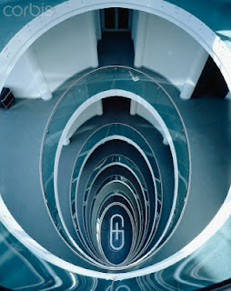
I thought this next photograph was a great example of breaking pattern. This is because there is a pattern of oval shapes constantly getting smaller, until there's a design at the bottom where the pattern breaks. This is a great way of bringing your eye to the focal point. The bottom of the building where this photograph was taken in focused, and the surrounding is blurred slightly. This helps draw your eyes to the focal point, because it creates a new contrast.
-Discord
Wednesday 10 October 2012
Hey guys!
I entered into a GFX Signature contest, and I thought I would share my entry with you guys :)

I entered into a GFX Signature contest, and I thought I would share my entry with you guys :)
I usually make my own backgrounds in my signatures, with the smudge tool, and some texture overlays, but I decided to use a stock for this background. I aded slight gaussian blur on the background in order to add some depth. I took my render (Shadow The Hedgehog) and placed it in the middle. I then added some overlay effects behind and around my render to add more depth. I then added a couple more overlay effects, and a "Apply Image" Gradient overlay on a hard light. I'm very happy with the way this signature turned out :)
-Discord
Monday 8 October 2012
For this weeks blog post we have to analyze some elements of design in action, so I thought I'd take a look at some of my old photography!
 In this picture you can see a great contrast between the foreground, and background because of the bright red colours in the foreground. The bright red really draws the eye towards the headphones, and in this case, the focal point. Even more contrast is happening, but not with the colours, but with the shapes. In the foreground the focal consists of geometric shapes, but in the background it had jagged organic shapes. You can also see value, because of the light source coming form the top left of the picture shining down onto the focal casting a shadow. There contrast between the background, and the foreground in texture, because in the foreground, it consists of a pair of glossy Beats by Dre headphones, but in the background it's mostly stone, and not much reflection of light as oppose to the glossy Beats.
-Discord

-Discord
Sunday 23 September 2012
 This week’s blog assignment we needed to examine, and dissect some logos, to find out what the artist was really trying to do with them. For my first logo I thought it would be fun to take a look at my dads logo. He’s a graphic designer, and me being an aspiring graphic designer, I’m really excited to go in depth examining his work. This logo is a mix between a abstract, and typographic signature. First let's that about the text. He's using a nice modern sans serif font, starting in all caps and design in lower case. I think this represents more of laid back feel, because of instead of rigid and uppercase he chose the text to be free flowing. There is also an abstract portion to this signature. The abstract portion on this logo includes ovals alternating in size, and shape. The way they're arranged it looks as though it has created a third dimension, and to me it looks as if ovals are come towards you, creating movement. This could symbolize that he finishes his work quickly and ofitantly. Ovals can also represent creativity which is essential for any graphic designer. A lot of emphasis is placed on the 6 which is being surounded by the abstract ovals. In my opinion the logo is a little bit off balance, because the abstract ovals are very focused around the 6 which is at the far right of the logo. I think this logo is definatly directed to companys looking for some modern graphic design. I think this because in my opinion the font, and the abstract look quite modern in my opinion.
 Finally I'll be looking at the Olympics logo. This logo is abstract and it includes 5 interlocking circles. Circles represent unity, and the different colours of each circle contrasting each other represent the differences between them. Since the circles are interlocked yet so different this could represent, different places coming together. The balance is perfect, and symmetrical. This could also represent the balance between all the different places in the world. I think this logo's target audience is everyone, because no matter where you are in the world, you're included in this logo design, because it represents unity between all the different nations.
-Discord
Thursday 20 September 2012
Hey guys!
This is my newest vertical forum signature I made in Photoshop! I post most of my work on GFX forums to get constructive criticism and the people on the forums said that there was too much shading on the text so I fixed that right up and now I'm sharing it with you guys! Everyone said the the lighting and depth looked great, so I'm very happy with how this design turned out.
-Discord

-Discord

Friday 14 September 2012
Art Critique 1
IMPRESSIONIST SUNSET, by Claude Monet

This piece This piece is in no way realistic, but that doesn't mean it's unrecognizable. I think it expresses feelings of sadness because of the gray/blue colours. The painting clearly depicts two boats floating down a stream near a construction site, with lots of fog coming out of nearby chimneys.
It feels to me, as if they are rebuilding after some great tragedy, because of the depressing colours, and the construction site, where it looks like they're rebuilding something rather than creating something. You can also see the sunlight just shining through the clouds, which gives a feeling of hope.
Another reason this painting makes me think of rebuilding, is because of where the sun is positioned you can tell it's dawn, so it's the beginning of a new day, which feels like a new beginning which sounds to me like hope.
The hues of the image create a contrast between the sun and the rest of the gay/blue area, which gives the sky a warmer feel. The lines and texture, and hue help create emphasis on the boat by putting it near contrasting colours, and making the hue on the boat darker. The direction where the water flows brings your eye closer to the people on the boat. Monet did a great job of taking the value down on the people, and the boat to create a great contrast, and also puts emphasis on the focal. The shapes are consistently organic, and have no sharp edges, giving the painting, a soft smooth feel. The balance in this piece is great and you can see the rule of thirds being used between the land and water.
I love this painting. I'm a big fan of Monet’s work. I love the quick brush stroke style of the piece, and the feelings of despair, but also hope that it conveys. I love the impressionist style, and one day I hope I am able to learn how to make brilliant pieces similar to this.
-Discord
Wednesday 12 September 2012

Tuesday 11 September 2012
Hey guys!
Since I'm new to this CyberArts Thing I thought I would post some work I've already done so you get a feel for my style. ^_^
Link: http://i.imgur.com/Id98k.jpg
(Image WAY To large to post :/)
This is a desktop background I did for myself about a month ago. I used Photoshop, and Cinema4D For the text. This was inspired by some Photo Manipulation speed arts I was watching, because as you can see the background is made of two different stocks. I didn't like the sky on the on the water stock, so I pen tool'd it out ;). I've been learning Photoshop, for about 2 months so I'm fairly new to it. Any feedback is greatly appreciated.
-Discord
Hey guys!
This tutorial helped me learn how to use the "Spray Can" feature in Adobe Illustrator. It's really a great tutorial. It's nice and slow paced, so you don't miss key details. It goes in depth in telling you the many different settings you can use to manipulate the tool. One thing I would have liked to have seen the tutorial maker talk about is the different things that the "Spray Can" tool would be practical for. I found after some exploring that the tool was able to paste certain symbols that might work in a simple logo, so I added some text and created this :D It's quite simple but I utilized what I learned in the tutorial to create it. Not bad for my first creation in Illustrator! I hope we go a lot more in depth into illustrator in the future. :)
Tutorial: http://www.youtube.com/watch?v=22NYOCl2gUc&feature=plcp -Discord
This tutorial helped me learn how to use the "Spray Can" feature in Adobe Illustrator. It's really a great tutorial. It's nice and slow paced, so you don't miss key details. It goes in depth in telling you the many different settings you can use to manipulate the tool. One thing I would have liked to have seen the tutorial maker talk about is the different things that the "Spray Can" tool would be practical for. I found after some exploring that the tool was able to paste certain symbols that might work in a simple logo, so I added some text and created this :D
It's quite simple but I utilized what I learned in the tutorial to create it. Not bad for my first creation in Illustrator! I hope we go a lot more in depth into illustrator in the future. :)Tutorial: http://www.youtube.com/watch?v=22NYOCl2gUc&feature=plcp -Discord
Subscribe to:
Posts (Atom)