Monday, 22 October 2012

Tech Blog Post #4--Photo Composition

For this blog post we have been asked to describe what makes our photo "Awesome". I had many compositional techniques in mind when taking this picture.


I used the soccer net for framing, by taking the picture of the keys through a hole in the net. I used depth of field by focusing in on my keys, while blurring rest of the area. Depth of field helps create a contrast in the image, by leaving the focal and surrounding area the only area not blurred. I also utilized rule of thirds in my photo by placing my focal on an intersecting point. There is also another contrast between the modern metallic keys, and the rugged, organic earth.  

One thing I would do to my photo if I could take it again with unlimited resources, is I would change the object I used for my focal. The keys work, but I would've liked to have had an object that contrasted with the background more colour wise. For example instead of using my keys in my opinion it would of been better if I had a bright blue ball, because the colours would contrast more.

I think I did a pretty good job on this picture, and I'm defiantly open to any constructive criticism anyone has. Thanks!
-Discord

Chess Piece

Hey guys!

For this assignment, we had to draw a chess piece with a visually interesting, yet effective background. First we have to talk about the methods we used to get the pictures on the computer. First we took pictures on the copy stand.
Copy Stand:

The copy stand picture was one of the better methods for capturing my chess piece. There wasn't a lot of glare on the darker areas. The colouring can be off because of the lighting but it is easily fixable. This is a great way of digitalizing your work. 
Outside:

For this method we used natural sunlight to light our  drawing before we captured them. I dislike this method because the amount of sunlight is very unpredictable. At the moment of capture the sunlight was a little too bright, and that caused a huge glare on my drawing.
Scan:

This method I thought in my personal opinion was my favourite. It captured the image perfectly, and had to glares from light. One problem with this method is the fact that you can't scan bigger artwork.

The Process:
I used a vary of lines in this piece. Most of my lines are quite thin, but the lines that are more thick are more important lines, and outlining areas near my focal point. I used value to give the illusion my chess piece is 3D and establish my light source. I tried to my my shading as realistic as possible. I used movement by making my lines lead towards my chess piece yet add another three dimensional effect. As your eyes go over my drawing the lines give the the illusion of depth and draw your glance to the middle, because of the design. The background resembles a hole, but the lines lead into the hole where my focal is.
-Discord

Another Blog!

Hey guys!

Today I thought I'd talk about one of my friend and classmates blogs. She does graffiti text, and other forms of drawing. She posts quite often so make sure to check her out! If Paintbrushes Could Talk
-Discord

Sunday, 21 October 2012

Newest Photo Manipulation


I'm really enjoying these photo manipulations I've been doing lately. For this one I really wanted to combine an urban and, rural environment. I thought I did a great job blending all of my components with lighting, and the use of a applied image on a soft light with a gradient on it to blend the colours. The original stock gave me a great opportunity with lighting, because I could create a spotlight effect on my focal point. I was also able to use leading lines in this piece, because of the path, and the shape of the subway tunnel all lead to my focal point. I was also able to use rule of thirds in this piece. The most time consuming part of this design was definatly the pentooling I had to do for every component, especially pentooling the woman.
-Discord


Saturday, 13 October 2012

Hey guys!

Today I made a photo manipulation in Photoshop. This is an area I would love to excel in, because you can create truly amazing things. I used a soft brush to establish the lighting, added an applied image with a gradient over lay, and put it on hardlight to make everything blend. This is the first environmental photomanipulation I've done, and it involved a great deal of pentooling. I'll include the original images so you can see what exactly I did to create this.
-Discord

Thursday, 11 October 2012

For this blog post I have to describe "depth", and "breaking pattern" in some photography. Breaking pattern is disrupting the flow of an image by having a sudden change. Depth Or Depth Of Field is when a camera or painting is focusing on one object and the rest of the picture is blurred or less sharpened.
First I thought it would be fun to look at some of my photography and analyze these elements. Let's talk about "depth" or "depth of field". In this photograph you seen depth of field as the camera focuses on the focal of the image while leaving the background slightly blurred. This helps to bring your eyes to the focal by creating a new sense of contrast. I also see breaking pattern in this photograph. in the background a lot of the area is full of organic shapes, while the focal breaks the pattern by being a very modern glossy shape.

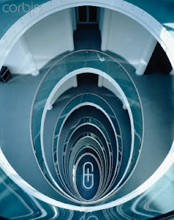
I thought this next photograph was a great example of breaking pattern. This is because there is a pattern of oval shapes constantly getting smaller, until there's a design at the bottom where the pattern breaks. This is a great way of bringing your eye to the focal point. The bottom of the building where this photograph was taken in focused, and the surrounding is blurred slightly. This helps draw your eyes to the focal point, because it creates a new contrast.
-Discord


Wednesday, 10 October 2012

Hey guys!
I entered into a GFX Signature contest, and I thought I would share my entry with you guys :)

I usually make my own backgrounds in my signatures, with the smudge tool, and some texture overlays, but I decided to use a stock for this background. I aded slight gaussian blur on the background in order to add some depth. I took my render (Shadow The Hedgehog) and placed it in the middle. I then added some overlay effects behind and around my render to add more depth. I then added a couple more overlay effects, and a "Apply Image"  Gradient overlay on a hard light. I'm very happy with the way this signature turned out :)

-Discord

Monday, 8 October 2012

For this weeks blog post we have to analyze some elements of design in action, so I thought I'd take a look at some of my old photography!

In this picture you can see a great contrast between the foreground, and background because of the bright red colours in the foreground. The bright red really draws the eye towards the headphones, and in this case, the focal point. Even more contrast is happening, but not with the colours, but with the shapes. In the foreground the focal consists of geometric shapes, but in the background it had jagged organic shapes. You can also see value, because of the light source coming form the top left of the picture shining down onto the focal casting a shadow. There contrast between the background, and the foreground in texture, because in the foreground, it consists of a pair of glossy Beats by Dre headphones, but in the background it's mostly stone, and not much reflection of light as oppose to the glossy Beats.

-Discord