Tuesday, 24 November 2015
Wednesday, 4 November 2015
Silence of the Lambs Movie Trailer Recut
When given this assignment I knew I wanted to do something drastic and funny. After exploring some options I nothing stood out until I watched the Silence of the Lambs trailer. I noticed all the lingering glances between Hannibal and Clarice and thought to myself how hilarious it would be if I recut the Silence of the Lambs into a romance. It fit the selection criteria perfectly as it was a huge change of pace/mood.
I selected Hello by Lionel Richie as the soundtrack. The song slowed down the pace of the trailer gave me time to develop/build up their relationship before the big "HELLO" pay off. The upbeat romantic nature of the song changed mood of many of the scenes (especially the winking scene) to be less creepy and more romantic.
The way the original trailer was edited I knew I needed to take my scenes directly from the movie. I hadn't seen the movie in a while so I decided to watch it and write down the time stamp of scenes I could take out of context. Doing this I was able to manufacture romantic moments and create some light drama. By changing the sharp jump cuts into slow transitions I eliminated the some of the uneasiness the original trailer was trying to create. Overall I think with my careful scene selection, smooth transitions, and mood altering music, I managed to create an effective (and hilarious) romance movie trailer.
Original:
Recut:
Monday, 9 February 2015
Wednesday, 4 February 2015
Logo Design
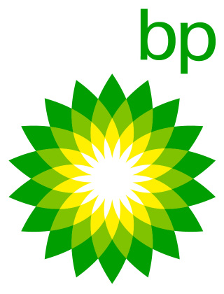
The bp logo incredibly well designed. It meets all 5 essential characteristics of a logo. At first glance it might seem like a complex design but in reality is actually quite simple. It uses very few shapes and a simple colour pallet. It also utilizes simple typography. The "bp" in the lowercase sans serif font is minimal, yet leaves a big impact because of how easily recognizable it is. All these simple components have a great deal to do with the memorability of the logo. If a logo is overcomplicated and convoluted, it makes it much harder for the logo to leave an impact on the audience. Of course it is impossible to tell if a logo will stand the test of time, as most do not. This logo however, I believe has staying power. Most of the logos of the past went out of style because they were overcomplicated and had tacky typography, while this logo has simple as well as elegant form and typography. This logo is also versatile because it can easily work in grayscale at any size and it is compact enough to fit on anything. The logo is appropriate for what the company is trying to communicate, however ironic that may be. The company is trying to trick the audience into thinking they are environmentally conscious even if obviously they are not. You can tell this is their objective due to their colour and form choices.
This logo is also shows the elements and principles of graphic design quite well. Its use of shape simple and elegant, as it repeats the same simple shapes. The balance is a little interesting. The pictorial portion of the logo is perfectly balanced while the text is placed almost as an after thought. This in my opinion puts the logo off balance which is a shame because I am a fan of the typography. If a little more thought was put in I believe it would bring up the quality of the logo. The rhythm of the piece is also a little confused and the flow goes from in to out in all directions. It does not flow in a particular direction. I would have maybe changed the form of the shapes to flow more in the direction of the bp text. This would fix the issue of balance and rhythm and would add emphasis to the text.
This logo for "Smooth Festival" a Polish Jazz festival is a very interesting logo. This is another logo that perfectly executes the 5 essential characteristics of a effective logo. It is very simple only using a few key overlapping shapes, as well as simple sans serif typography. It is memorable because of the interesting affect that is created with the overlapping colours. It's originality really carries this logo. Like the bp logo, the simplicity of the shapes and the simple typography also help with memorability. I feel like this logo will stand the test of time as it doesn't have the complex typography that tends to date logos. Maybe the art will be seen as cheesy in a few years but I enjoy it. The logo is not versatile due to the fact that it would not work in grayscale. It wouldn't have the same colour effect that makes it so memorable. I do however believe this logo is very appropriate for a music festival, as the smooth shapes and colour effect makes me think of art; more specifically music.
It uses the elements and principles of graphic design in many ways. It uses colour to create an interesting effect which adds to the memorability of the logo. It uses simple organic shapes which adds to the art feel. It's almost perfectly balanced without being symmetrical, and there is a strong sense of unity because of this balance. The dark contrast between the centre and the outside colours put emphasis on the typography as well because it is placed in the dark centre.
Overall both logos do a great job summing up their brand and design wise they are very effective.
Subscribe to:
Comments (Atom)


